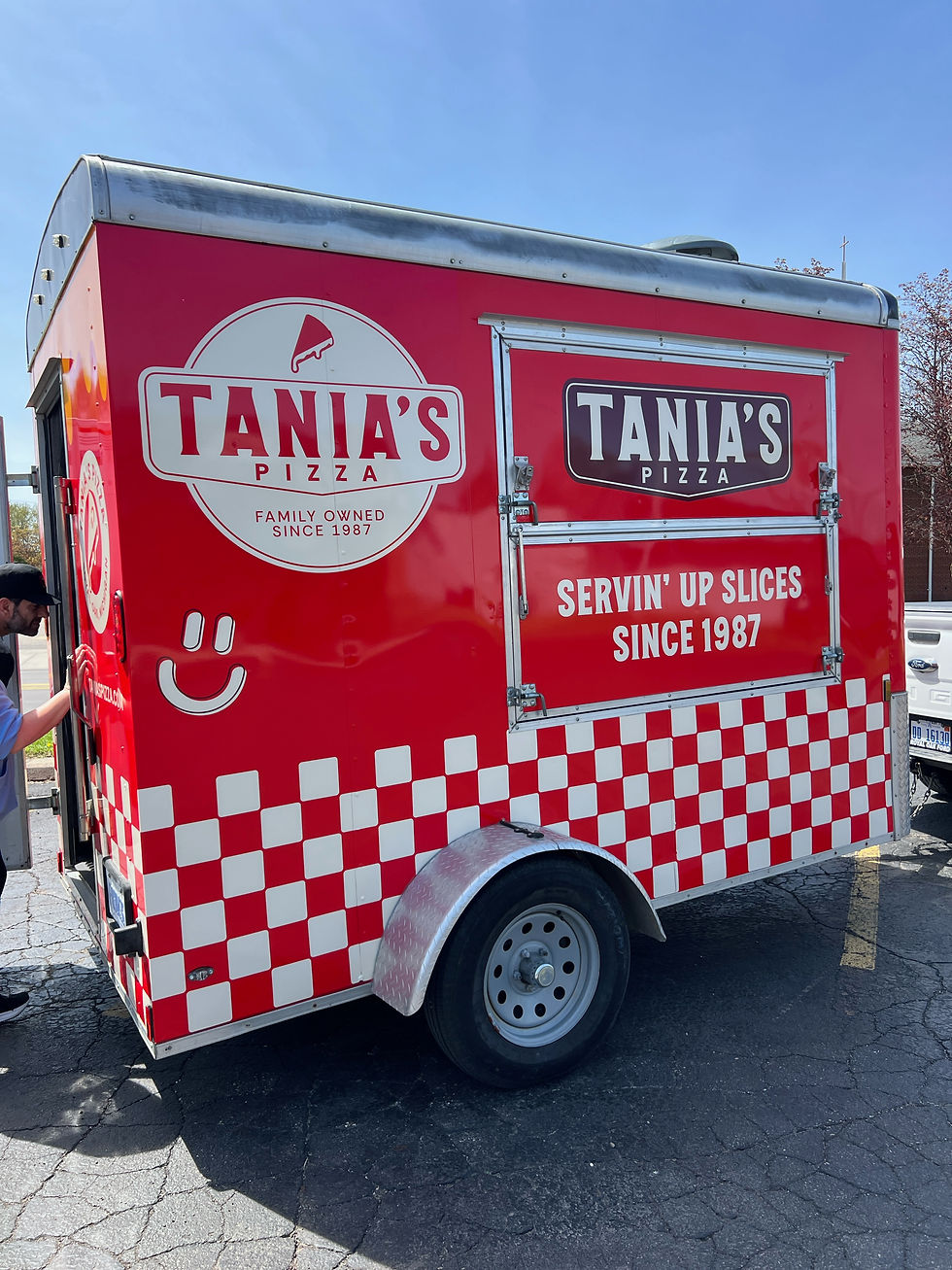
branding + social + print collateral + website
positioning
nostalgic, right around the corner, family owned pizza shop
principles
handmade
bold
nostalgic
unique
tone of voice
community- focused
trustworthy
casual
not-too-serious
+ branding
+ social
+ print collateral
+ website
positioning
nostalgic, right around the corner, family owned pizza shop
principles
handmade
bold
nostalgic
unique
tone of voice
community-focused
trustworthy
casual
not-too-serious
diving into the fix
Leaning into the goals, values and audience of Tania's Pizza, I was able to home in on their brand positioning, brand principles and tone of voice.
Using their previous logo as a jumping off point, I began by simplifying the bits that did not serve a strategic or creative purpose.
A logo suite was developed for use across many mediums relevant to Tania's Pizza: store signage, product packaging, social media, web, etc.

understanding the problem
Tania's Pizza has been around since the 80's and, unfortunately, their branding had not caught up to 2024. The struggle was to appeal to the younger, newer pizza-lovers while keeping that spark that made them a community staple.
They had gotten a new logo, but it did not give them room to grow and flex as a brand as it was a single logo. This new logo was busy, unnecessarily complicated and did not speak to their values. However, Tania's Pizza liked the direction the logo could have gone with a proper strategic and creative approach

making the brand unique
Something that is very unique to Tania's Pizza is their stuffed pizza offering. Not only is this unique in itself, but Tania's Pizza lovers know very well their cheesy smiley face added to a pie.
Knowing this beloved signature, I knew I had to bring this to the branding.
From here, I developed a logo mark embodying the signature cheesy smile slice.
=)


Tania's Pizza has been around since the 80's and, unfortunately, their branding had not caught up to 2024. The struggle was to appeal to the younger, newer pizza-lovers while keeping that spark that made them a community staple.
They had gotten a new logo, but it did not give them room to grow and flex as a brand as it was a single logo. This new logo was busy, unnecessarily complicated and did not speak to their values. However, Tania's Pizza liked the direction the logo could have gone with a proper strategic and creative approach
understanding the problem


Leaning into the goals, values and audience of Tania's Pizza, I was able to home in on their brand positioning, brand principles and tone of voice.
Using their previous logo as a jumping off point, I began by simplifying the bits that did not serve a strategic or creative purpose.
A logo suite was developed for use across many mediums relevant to Tania's Pizza: store signage, product packaging, social media, web, etc.
diving into the fix

the old logo •

We can spice up a graphic to bring a little more life into the logo and create something unique.
Color pairings with enough contrast will be crisp and bold.
Too many details and typefaces can make a logo feel busy when we are trying to represent the clean, homemade characteristic.
The pop of pure white is harsh and feels too new rather than nostalgic.

making the brand unique
Something that is very unique to Tania's Pizza is their stuffed pizza offering. Not only is this unique in itself, but Tania's Pizza lovers know very well their cheesy smiley face added to a pie.
Knowing this beloved signature, I knew I had to bring this to the branding.
From here, I developed a logo mark embodying the signature cheesy smile slice.
=)


rejected versions


